Semiotics of WW2 Propaganda: Creating Solidarity through Binary Opposition

World War Two was a challenging time for every country. To maintain the war effort, propaganda was used to create a sense of solidarity among citizens. This article explores the use of binary opposition in propaganda and its effectiveness in mobilizing public support.
- Uploaded on | 1 Views
-
 adeline
About Semiotics of WW2 Propaganda: Creating Solidarity through Binary Opposition
PowerPoint presentation about 'Semiotics of WW2 Propaganda: Creating Solidarity through Binary Opposition'. This presentation describes the topic on World War Two was a challenging time for every country. To maintain the war effort, propaganda was used to create a sense of solidarity among citizens. This article explores the use of binary opposition in propaganda and its effectiveness in mobilizing public support.. The key topics included in this slideshow are Semiotics, WW2 Propaganda, Binary Opposition, Dehumanization, Production, Enlistment,. Download this presentation absolutely free.
Presentation Transcript
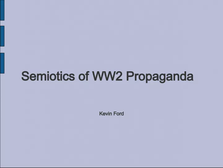
1. Semiotics of WW2 Propaganda Kevin Ford
2. World War Two (WW2) was a trying time for the entire world. All of the countries involved had problems with creating solidarity among the citizens The easiest way to get the citizens to work for the good of the country is to create a binary opposition, in this case, Us vs. Them
3. To create the sides and maintain the war effort five key points had to be gotten across the other side needs to be dehumanized Resources need to be conserved Production needs to remain high Secrets need to be kept Men need to enlist
4. All of the images to be used in propaganda need to be simple so they pass the conscious mind Bold colors to catch attention For the positive messages we get strong images of strong people. For the negative messages we see caricatures and anthropomorphizing
5. Dehumanizing Here's an example of a Dehumanizing poster. Note the contrast to draw the eye directly to the rat's head getting smashed The other colors are simple and do not draw attention to themselves The rat is representative of the Emperor of Japan, complete with mustache, glasses and overbite.
6. Dehumanizing T he first step to dehumanizing is to stop calling the other side people. We come up with new names and they become the slurs of the future
7. Dehumanizing With the opponent now called something other than person we can show him as something sub-human In this case, vermin that needs to be eliminated
8. Dehumanizing Note how the rat pictured has several important features of the Emperor Tojo, as well as the rising sun on the hat. These simple and cartooney pictures lead us to associate the leader of a people, and thus the people, to a rat
9. Dehumanizing This poster has a dual purpose In addition to dehumanizing the enemy, it also urged the citizens to curb their waste Unlike other posters that urged a particular kind of saving (ie rubber conservation or scrap drives) this simply urges conservation in general
10. Dehumanizing The image, like all texts like it, brings a very nationalistic code to it It really pushes one real ideology, that America is superior. This image creates that positive feeling by pushing the binary opposition of Them vs. Us They are like rats, We are better than rats
11. Conservation The Next major message that Propaganda gives us is the feeling that the people at home could also contribute This gave rise to the phrase home front Front in this case meaning a theater of war The phrase giving the people at home a sense of martial connectedness, not only to the troops, but to each other as well because everyone was fighting this war.
12. Conservation This is a good example of a conservation poster Once again, note the bold colors and simple lines of the image The opposition here is clear, you stand with America or against America
13. Conservation The gentleman in the picture is clearly well off, as he is dressed in a slick purple suit It may point to the organized criminal element, as they were known for wearing snappy suits like this.
14. Conservation In much the same vein as the previous poster, the image of Hitler is far from lifelike Even if it were a fleshed out picture, Hitler would appear as a cartoon next to the fairly lifelike man The reason for the Germans appearing human while the Japanese are rats is simple racism. Combined with the incident of Pearl Harbor, the Japanese were demonized more than the white enemy were.
15. Conservation The typeface of this poster is in the Modernist tradition It pursues readability over any meaning the typeface may project onto the words This lends to the perceived transparency of the image.
16. Conservation When thinking about car-related materials that would need to be conserved, one goes to fuel. This poster is actually referring to rubber, and the wear on tires. The frame of reference has changed since 1944.
17. Conservation The idea of car-sharing clubs, or carpools as we call them now, is still very much around, though it is for a different purpose now. Most people carpool to reduce the amount of fuel it takes to get to work, or to lessen the number of cars on the road. The focus of the practice has shifted from a cause to ourselves. This is a trend that can be seen through the last decades, as we have shifted our focus from causes and other external ventures to ourselves.
18. Conservation In the If you ride alone... poster the standard myth of America is changed. In normal times the myth of America would be cruising on the highway alone enjoying your own success The poster suggests that America can sacrifice what is normal in pursuit of victory over what is understood to be the enemy, the thing that opposes America
19. Production The next image is an example of positive propaganda It is meant to inspire and urge the viewers to work hard to support the troops It is another example of attempting to inspire martial pride in the everyday work that helped to fuel the war effort Home Front warriors
20. Production Once again, bright colors and very simple lines. The figures in the image are highly stylized lending to the idea that either man could do either job, make the men interchangeable
21. Production The artist made obvious parallels between the rivet gun and the machine gun here This symbolizes the need to keep up pressure on both the home front and the war front The artist gives the impression both that the machine gun is more important and that it is supported by the rivet gun by placing the machine gun the foreground
22. Production The figures in this poster are both highly stylized and very similar This suggests that they could be the same man, or possibly be an everyman, an embodiment of the American man, one who can do anything that he puts his mind to.
23. Production The message of Give 'em both Barrels suggests the one-two punch, making it a statement of grit, suggesting a fistfight. The picture makes it the one-two punch of military and economic might One might boil down the concept of wartime industry as build tanks/boats/planes faster than the enemy can blow them up, making this poster applicable to that theory.
24. Secrets Naturally during the war a paranoia developed about spies. There were several campaigns aimed at keeping the citizens aware of what they were speaking about and not discussing where family members were going. The posters warned about talking about war materials, troop movements, and ship departures and destinations There was actually very little spy activity in the United States due to the geographic barriers of the oceans
25. Secrets This example is a very negative picture, detailing the consequences of talking about ship movements We see a man drowning in the ocean Caption of Someone Talked! The man's arm and finger are extended toward the viewer, giving blame for his situation to the viewer Dark colors increase the sense of isolation and doom in the picture
26. Secrets The face of the drowning man is meant to be handsome, extending the Myth of America He is also terrified in the face of his death His face also looks like he is assigning blame, probably to the viewer
27. Secrets The man's hand is stretched out toward the viewer The gesture can be read in two ways With the finger extended it seems to point to the viewer, perhaps assigning blame for the ship's sinking The man also seems to be reaching out for help, as if the viewer could save him from drowning The man's hand is very purposefully posed this way
28. Secrets The typeface on the caption is modern, as discussed earlier The ambiguity of the message doesn't directly blame the viewer, but the image implies such. The caption itself would make the viewer think that something they said could trigger a tragedy like the one shown on the poster and thus be more likely to watch the topics of conversations.
29. Secrets con't Another, more lighthearted design for keeping secrets The message is no less dire, but it is presented in a less personal way This may make the poster less effective visually, but the slogan has become a very common phrase The bold colors and stylized ocean and ship make this memorable
30. Secrets The importance of secrets in wartime is tantamount Naturally the governments waging the war wanted to keep troop movements, the capabilities of their war machines, and the movements of fleets secret Posters like this were mean to hazard the populace into being sure that they didn't let something slip There were more posters that were more stylized and presented their material in a more lighthearted way, giving rhymes to the viewer (loose lips sink ships etc.)
31. Enlist Everyone has seen the face of Uncle Sam, who first adorned the recruitment posters during WW2 Though Sam was far from the only gimmick they used to get men to enlist. Some of the posters depicted how awesome being in the service was while others mentioned the benefits of being in the service
32. Enlist This image is showing how heroic the services are They generally just show how badass Americans are It shows none of the death that is involved with service, just how awesome the Airborne is/was
33. Enlist If one looked closely at the soldiers' faces we see, from this one, a smiling face He is happy to be making a combat drop into enemy territory, defending freedom the whole way. This expands the myth of America by showing that her soldiers are always cool under fire His dynamic pose is also pretty badass, making it look like a soldier of the airborne would spend his days looking awesome
34. Enlist Next we have this gentleman. He is, again, looking awesome and shooting a Thompson gun. The way he is posed is meant to inspire rather than give an impression of soldiering If he were under live fire he'd be prone in the mud, a much less heroic pose It would also appear that his model of Thompson shoots lasers.
35. Enlist The phrase that is given with the picture is they've got the GUTS The phrase states that the airborne has the chutzpah and drive to get things done The phrase implies that something is missing, perhaps the viewer, as an urging to enlist.
36. Enlist The banner is extremely functional It states clearly that the airborne will take the war all the way, meaning to Berlin The coloring of the banner is super patriotic The stars on the ends are also a patriotic gesture though they could also be insignia, promising rank to the viewer
37. Enlist T his poster is from WW1 but the same principals still apply. A smiling, presumably handsome man offers his hand out to the viewer to invite him into the USMC The caption asks Want action? Join the US Marine Corps
38. Enlist The marine on the poster looks combat ready, he has his kit on his back, his helmet is on and he has a rifle in hand By offering his hand to the viewer, he is not only offering them a place in the action but also the fabled bond of brotherhood This man also is a sergeant, his rank making him accessible but also a figure to aspire to
39. Enlist The background that the marine is shown in is wide open, it is in fact a skyline of the ocean. The image includes a plane on the right side of the image and a ship sprouting from the marine's hip. All of these point towards the possibilities of travel and adventure. The openness give a feeling of freedom, ironic given how rigid the military structure is.
40. Enlist The typeface on the slogan is an odd serif font, and feels very old. The message is clear, if the viewer wanted to get in on combat, then they should join the Marines, who go where the fighting is the hottest, anywhere on the planet.
41. Enlist During the war the amount of recruits needed was astounding. All one has to do is look at casualty numbers from any of the major actions to see that men were dying in the hundreds of thousands. Those men needed to be replaced, and the replacements needed to be willing and ready to fight. The myth of America was perpetuated in the posters to instill a feeling of impotence unless one was a member of the services.
42. These were not the only posters obviously There were several other campaigns designed for the military or for occupation/liberation of countries. There was the This is your friend campaign The Russian entry seems very ironic after the Cold War
43. Some of the other posters were incredibly racist. Some of these were late war posters when our only enemy was Japan The caricature of the Japanese in the form of Tokio Kid is really horrible and very efficiently dehumanizing The pointy ears, fangs and overbite create a truly ridiculous image
44. This poster was aimed at keeping the public willing to do anything for the war effort. It creates a sense of inadequacy in the viewer by implying that they are not doing enough to defeat the enemy, that they have not sacrificed enough. May also have been an attempt in shaming more young men into enlisting.
45. I personally have always loved this one. It urges greater production to keep the fighter pilots and other branches supplied, and by proxy fight for the country. Pilots were viewed as romantic and especially brave. It was a job that garnered a lot of glory for the men.
46. Parody Naturally the iconic style, straight up racism and outrageous claims of the propaganda posters attracted attention in recent years. With the powers of Photoshop and similar programs people have blasted these posters and made ones that are fitting for the current time and political climate. Rather than the staunch conservative approach, many of these posters
47. Parody This is one of the photoshopped images, a direct parody of one of the posters I previously discussed. Keep it phallic makes the Freudian point of many Enlistment-type posters. The one that is shopped into the current state is one of the worse offenders but a lot of them were bad.
48. Parody The Captain America poster is a promotion for the new movie coming out soon It uses the classic propaganda conventions and models itself after the this is your friend poster The other here is a Star Wars parody of the 40's style; nothing is complete without a Star Wars reference.
49. Conclusion All in all the style created by the propaganda campaigns of the 40's is really timeless and extremely recognizable. The bold colors and simple, stylized images that they introduced made for iconic and effective campaigns to rally the citizens of the US to fight what is often considered the most world changing war since the Napoleonic Wars. Each of the posters perpetuates the American myth in it's own way, most often by either showing Americans as superior, or showing the Enemy as inferior.
50. Images Airborne poster courtesy of http://www.dogfacesoldiers.org/info/memoirs/beardslee/signing.htm USMC poster courtesy of http://www.pbs.org/wnet/aalives/teachers/freedom_to_fight.html When you ride alone... courtesy of http://www.flickr.com/photos/joeventures/309856393/ Jap trap courtesy of http://www.sharenator.com/World_War_Two_Propaganda_Posters/#/american_3-11.html Both Barrels courtesy of https://bshs- americanhistory1.wikispaces.com/Sacrifices+at+Home Someone Talked and Someone Tweeted courtesy of http://andyhorst.com/post/147080229/propaganda-posters-the-one-on-bottom-is-a-real Loose lips courtesy of http://www.bakati.com/s~q-ww2-propaganda-posters.aspx Tokio kid courtesy of http://www.cafepress.com/geeklife.284009586 You talk of sacrifice courtesy of http://web.mit.edu/course/21/21h.102/www/Primary%20source%20collections/World%20W ar%20II/WWII%20propaganda%20posters.html Starships courtesy of http://locustsandhoney.blogspot.com/2010_02_01_archive.html Keep it phallic courtesy of http://www.crestock.com/blog/design/propaganda-parodies-part- 2-join-the-proctological-corps-183.aspx Captain America courtesy of http://www.flickr.com/photos/26556659@N07/2959349045/