Introduction to Causal Loop Diagrams in System Dynamics

Learn about the importance of feedback in system dynamics and how to use causal loop diagrams to capture the structure of systems and communicate important feedbacks.
- Uploaded on | 7 Views
-
 argelia
About Introduction to Causal Loop Diagrams in System Dynamics
PowerPoint presentation about 'Introduction to Causal Loop Diagrams in System Dynamics'. This presentation describes the topic on Learn about the importance of feedback in system dynamics and how to use causal loop diagrams to capture the structure of systems and communicate important feedbacks.. The key topics included in this slideshow are System dynamics, causal loop diagrams, feedback, mental models, stock and flow maps,. Download this presentation absolutely free.
Presentation Transcript
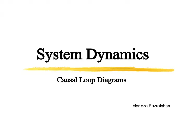
1. System Dynamics Morteza Bazrafshan Causal Loop Diagrams
2. Causal Loop Diagrams Feedback is one of the core concepts of system dynamics. Yet our mental models often fail to include the critical feedbacks determining the dynamics of our systems. In system dynamics we use several diagramming tools to capture the structure of systems, including causal loop diagrams (CLD) and stock and flow maps . CLDs are excellent for: Quickly capturing your hypotheses about the causes of dynamics ; Eliciting and capturing the mental models of individuals or teams; Communicating the important feedbacks you believe are responsible for a problem.
3. CAUSAL DIAGRAM NOTATION A causal diagram consists of variables connected by arrows denoting the causal influences among the variables. Variables are related by causal links , shown by arrows. Each causal link is assigned a polarity, either positive (+) or negative (-) to indicate how the dependent variable changes when the independent variable changes. The important loops are highlighted by a loop identifier which shows whether the loop is a positive ( reinforcing ) or negative ( balancing ) feedback.
4. CAUSAL DIAGRAM NOTATION Note that the loop identifier circulates in the same direction as the loop to which it corresponds. A positive link means that if the cause increases, the effect increases above what it would otherwise have been , and if the cause decreases, the effect decreases below what it would otherwise have been . In the previous example an increase in the fractional birth rate means the birth rate (in people per year) will increase above what it would have been, and a decrease in the fractional birth rate means the birth rate will fall below what it would have been. A negative link means that if the cause increases, the effect decreases below what it would otherwise have been , and if the cause decreases, the effect increases above what it would otherwise have been . In the example, an increase in the average lifetime of the population means the death rate (in people per year) will fall below what it would have been, and a decrease in the average lifetime means the death rate will rise above what it would have been. Link polarities describe the structure of the system. They do not describe the behavior of the variables. That is, they describe what would happen IF there were a change.
5. CAUSAL DIAGRAM NOTATION They do not describe what actually happens . The fractional birth rate might increase; it might decrease the causal diagram doesn't tell you what will happen. Rather, it tells you what would happen if the variable were to change. An increase in a cause variable does not necessarily mean the effect will actually increase. There are two reasons : First, a variable often has more than one input . To determine what actually happens you need to know how all the inputs are changing . When assessing the polarity of individual links, assume all other variables are constant Second, and more importantly, causal loop diagrams do not distinguish between stocks and flows the accumulations of resources in a system and the rates of change that alter those resources An increase in the birth rate will increase the population , but a decrease in the birth rate does not decrease the population . Births can only increase the population, they can never reduce it.
6. Similarly, the negative polarity of the link from the death rate to population indicates that the death rate subtracts from the population. A drop in the death rate does not add to the population. A drop in deaths means fewer people die and more remain alive: the population is higher than it would otherwise have been. CAUSAL DIAGRAM NOTATION
7. GUIDELINES FOR CAUSAL LOOP DIAGRAMS Causation versus Correlation Every link in your diagram must represent (what you believe to be) causal relationships between the variables. You must not include correlations between variables . A system dynamics model must mimic the structure of the real system well enough that the model behaves the same way the real system would . Behavior includes not only replicating historical experience but also responding to circumstances and policies that are entirely novel . Correlations among variables reflect the past behavior of a system. Though sales of ice cream are positively correlated with the murder rate, you may not include a link from ice cream sales to murder in your models.
8. GUIDELINES FOR CAUSAL LOOP DIAGRAMS Causation versus Correlation many correlations are more subtle , and it is often difficult to determine the underlying causal structure . A great deal of scientific research seeks the genuine causal needles in a huge haystack of correlations: - Does vitamin C cure the common cold? - Can eating oat bran reduce cholesterol, and if it does, will your risk of a heart attack drop? - Does economic growth lead to lower birth rates, or is the lower rate attributable to literacy, education for women, and increasing costs of child rearing? - Do companies with serious quality improvement programs earn superior returns for stockholders? Modelers must take extra care to consider whether the relationships in their models are causal, no matter how strong the correlation , how high the R 2 , or how great the statistical significance of the coefficients in a regression may be.
9. GUIDELINES FOR CAUSAL LOOP DIAGRAMS Labeling Link Polarity Be sure to label the polarity of every link in your diagrams.
10. GUIDELINES FOR CAUSAL LOOP DIAGRAMS Determining Loop Polarity Imagine a small disturbance in one of the variables. - If the disturbance propagates around the loop to reinforce the original change , then the loop is positive . - If the disturbance propagates around the loop to oppose the original change , then the loop is negative . There are two methods for determining whether a loop is positive or negative: 1- Count the Number of Negative Links - The fast method always works. . . except when it doesn't ! - In a complex diagram it is all too easy to miscount the number of negative links in a loop. - And it is easy to mislabel the polarity of links when you first draw the diagram. - Counting the number of negative signs is unlikely to reveal these errors.
11. GUIDELINES FOR CAUSAL LOOP DIAGRAMS Determining Loop Polarity 2- Trace the Effect of a Change around the Loop - trace the effect of a small change in one of the variables as it propagates around the loop. - You can start with any variable in the loop. The result must be the same. Identify and label the polarity of the links and loops in the examples shown.
12. GUIDELINES FOR CAUSAL LOOP DIAGRAMS CHALLENGE Assigning Link Polarities Consider the attractiveness of a product to customers as it depends on various attributes of the product. Assign link polarities. What feedback loops might be created as product attractiveness changes the demand for the firm's product?
13. GUIDELINES FOR CAUSAL LOOP DIAGRAMS Mathematics of Loop Polarity When you determine loop polarity , you are calculating what is known in control theory as the sign of the open loop gain of the loop . The term "gain" refers to the strength of the signal returned by the loop: - A gain of two means a change in a variable is doubled each cycle around the loop - A gain of negative 0.5 means the disturbance propagates around the loop to oppose itself with a strength half as large. The term " open loop " means the gain is calculated for just one feedback cycle Consider an arbitrary feedback loop consisting of n variables, X 1 , ,X n . let X 1 denote the variable you choose. When you break the loop, X 1 splits into an input, X 1 I and output, X 1 O The open loop gain is defined as the (partial) derivative of X 1 O with respect to X 1 I
14. GUIDELINES FOR CAUSAL LOOP DIAGRAMS Mathematics of Loop Polarity The polarity of the loop is the sign of the open loop gain: Polarity of loop = SGN(X 1 O / X 1 I ) The open loop gain is calculated by the chain rule from the gains of the individual links: SGN(X 1 O / X 1 I ) = SGN[(X 1 O / X n ) (X n / X n-1 ) (X 2 / X 1 I )
15. GUIDELINES FOR CAUSAL LOOP DIAGRAMS All Links Should Have Unambiguous Polarities - Sometimes people say a link can be either positive or negative , depending on other parameters or on where the system is operating. - If demand is highly elastic , a higher price means less revenue because a 1% increase in price causes demand to fall more than 1%. - When you have trouble assigning a clear and unambiguous polarity to a link it usually means there is more than one causal pathway connecting the two variables.
16. GUIDELINES FOR CAUSAL LOOP DIAGRAMS CHALLENGE
17. GUIDELINES FOR CAUSAL LOOP DIAGRAMS Name Your Loops To help your audience navigate the network of loops, it's helpful to give each important feedback a number and a name . Numbering the loops RI, R2, B1, B2, and so on helps your audience find each loop as you discuss it. Causal diagram developed by engineers and managers in a workshop designed to explore the causes of late delivery for their organization's design work.
18. GUIDELINES FOR CAUSAL LOOP DIAGRAMS Variable Names 1- Variable Names Should Be Nouns or Noun Phrases The actions (verbs) are captured by the causal links connecting the variables. A causal diagram captures the structure of the system , not its behavior-not what has actually happened but what would happen if other variables changed in various ways. Adding the verb " rises " to the diagram presumes costs will only rise . It is confusing to talk of a decrease in costs rising or a fall in price increases. Are prices rising, rising at a falling rate, or falling?
19. GUIDELINES FOR CAUSAL LOOP DIAGRAMS Variable Names 2- Variable Names Must Have a Clear Sense of Direction Choose names for which the meaning of an increase or decrease is clear , variables that can be larger or smaller . Without a clear sense of direction for the variables you will not be able to assign meaningful link polarities .
20. GUIDELINES FOR CAUSAL LOOP DIAGRAMS Variable Names 3- Choose Variables Whose Normal Sense of Direction Is Positive Avoid the use of variable names containing prefixes indicating negation (non, un, etc.) Standard accounting practice is Profit = Revenue - Costs , so the better variable name is Profit, which falls when costs rise and rises when costs fall. criticism may make you unhappy, but it is confusing to speak of rising unhappiness
21. GUIDELINES FOR CAUSAL LOOP DIAGRAMS Tips for Causal Loop Diagram Layout To maximize the clarity and impact of your causal diagrams, you should follow some basic principles of graphic design: 1. Use curved lines for information feedbacks. Curved lines help the reader visualize the feedback loops. 2. Make important loops follow circular or oval paths . 3. Organize your diagrams to minimize crossed lines . 4. Don't put circles , hexagons , or other symbols around the variables in causal diagrams. 5. Iterate . Since you often won't know what all the variables and loops will be when you start, you will have to redraw your diagrams, often many times, to find the best layout.
22. GUIDELINES FOR CAUSAL LOOP DIAGRAMS Choose the Right Level of Aggregation Causal loop diagrams are designed to communicate the central feedback structure of your dynamic hypothesis. They are not intended to be descriptions of a model at the detailed level of the equations. Having too much detail makes it hard to see the overall feedback loop structure and how the different loops interact . Having too little detail makes it hard for your audience to grasp the logic and evaluate the plausibility and realism of your model. If your audience doesn't grasp the logic of a causal link, you should make some of the intermediate variables more explicit .
23. GUIDELINES FOR CAUSAL LOOP DIAGRAMS Don't Put All the Loops into One Large Diagram Short-term memory can hold 7+- 2 chunks of information at once. This puts a rather sharp limit on the effective size and complexity of a causal map. Resist the temptation to put all the loops you and your clients have identified into a single comprehensive diagram. Build up your model in stages , with a series of smaller causal loop diagrams .
24. GUIDELINES FOR CAUSAL LOOP DIAGRAMS Make the Goals of Negative Loops Explicit All negative feedback loops have goals . All negative loops function by comparing the actual state to the goal , then initiating a corrective action in response to the discrepancy. There are exceptions to the principle of showing the goals of negative loops. Consider the death rate loop . The goal of the death rate loop is implicit (and equal to zero: in the long run, we are all dead).
25. GUIDELINES FOR CAUSAL LOOP DIAGRAMS Indicate Important Delays in Causal Links Delays are critical in creating dynamics. Delays give systems inertia , can create oscillations , and are often responsible for trade-offs between the short- and long-run effects of policies. Your causal diagrams should include delays that are important to the dynamic hypothesis or significant relative to your time horizon.
26. GUIDELINES FOR CAUSAL LOOP DIAGRAMS Distinguish between Actual and Perceived Conditions Often there are significant differences between the true state of affairs and the perception of that state by the actors in the system . There may be delays caused by reporting and measurement processes. There may be noise, measurement error, bias, and distortions . Example: There may be significant delays in assessing quality and in changing management's opinion about product quality. Separating perceived and actual conditions helps prompt questions such as: -How long does it take to measure quality ? -To change management's opinion about quality even after the data are available? -To implement a quality improvement program ? - To realize results?
27. GUIDELINES FOR CAUSAL LOOP DIAGRAMS Distinguish between Actual and Perceived Conditions
28. DEVELOPING CAUSAL DIAGRAMS FROM INTERVIEW DATA Much of the data a modeler uses to develop a dynamic hypothesis comes from interviews and conversations with people in organizations. There are many techniques available to gather data from members of organizations, including: - Surveys - Interviews - Participant observation - Archival data - And so on Once you've done your interviews, you must be able to extract the causal structure of the system from the statements of the interview subjects. Formulate variable names so that they correspond closely to the actual words used by the person you interviewed, while still adhering to the principles for proper variable name selection described above ( noun phrases, a clear and positive sense of direction ).
29. DEVELOPING CAUSAL DIAGRAMS FROM INTERVIEW DATA Process Improvement The following two quotes are actual interview transcripts developed in fieldwork carried out in an automobile company in the United States. The managers , from two different component plants in the same division of the company, describe why the yield of their lines was persistently low and why it had been so difficult to get process improvement programs off the ground In the minds of the [operations team leaders] they had to hit their pack counts [daily quotas]. This meant if you were having a bad day and your yield had fallen. . . You had to run like crazy to hit your target. You could say, "You are making 20% garbage, stop the line and fix the problem," and they would say, "I can't hit my pack count without running like crazy." They could never get ahead of the game. - Manager at Plant A Supervisors never had time to make improvements or do preventive maintenance on their lines. . . they had to spend all their time just trying to keep the line going, but this meant it was always in a state of flux. . . because everything was so unpredictable. It was a kind of snowball effect that just kept getting worse. Supervisor at Plant B
30. DEVELOPING CAUSAL DIAGRAMS FROM INTERVIEW DATA Process Improvement Develop a single causal diagram capturing the dynamics described by the interviews. Build your diagram around the basic physical structure shown below
31. Example: MANAGING YOUR WORKLOAD Problem Definition Consider the process of managing your workload: - A student ( imagine yourself ) must balance classes and assignments with outside activities , a personal life , and sleep . - During the semester you attend classes, do the readings, and hand in assignments as they are due - You probably try to work harder if you think your grades are lower than you desire and take more time off when you are sleepdeprived. There are two basic policies you can follow: (1) The ant strategy: never put off until tomorrow what you can do today (2) the grasshopper strategy: never do today what can be put off until tomorrow.
32. Example: MANAGING YOUR WORKLOAD Problem Definition - The ant works steadily throughout the semester as work is assigned and never builds up a large backlog of assignments. - As a result, the ant avoids the end of semester crunch , keeps the workweek under control, and is able to stay well rested . - Because the ant gets enough sleep, productivity is high, and the ant has plenty of time to participate in outside activities . - The ant's grades improve steadily throughout the term. - The grasshopper, in contrast, defers the work until the last minute. - The grasshopper's workweek is low at the beginning of the term, providing lots of time for parties and outside activities . - The grasshopper can stay reasonably well rested despite a heavy social schedule because the workweek is low. - But because the grasshopper doesn't do the work as fast as it is assigned, the assignment backlog steadily builds up.
33. Example: MANAGING YOUR WORKLOAD Problem Definition - Eventually, it's crunch time , and the grasshopper starts putting in long hours , perhaps pulling a few all-nighters . - Unfortunately, as sleep suffers , energy and productivity fall. - The rate and quality of work suffers. - Grades plummet , and the term ends before the grasshopper can finish all the work , perhaps leading the grasshopper to plead for extensions from the faculty.
34. Example: MANAGING YOUR WORKLOAD ant strategy
35. Example: MANAGING YOUR WORKLOAD grasshopper strategy
36. Example: MANAGING YOUR WORKLOAD Identifying Key Variables -Assignment rate: the rate at which professors assign work throughout the term (tasks/week). -Work completion rate: the rate at which tasks are completed (tasks/week). -Assignment backlog: the number of tasks that have been assigned but not yet completed (tasks). -Grades: the grade received for work handed in (0-100 scale). -Workweek: the number of hours spent on academic work, including classes, reading, homework, projects, etc. (hours/week). -Energy level: measures how well rested the student is. Arbitrary scale from 0-100% where 100% = fully rested and 0 = comatose). Other variables could be added, but this set provides a reasonable starting point for conceptualization of the feedback structure governing the dynamics.
37. Example: MANAGING YOUR WORKLOAD Developing the Causal Diagrams The Assignment Rate is assumed to be exogenous : Once a student has signed up for a set of courses, the assignment rate is determined. Classes can sometimes be dropped , but this possibility is ignored for now.
38. Example: MANAGING YOUR WORKLOAD Developing the Causal Diagrams
39. Example: MANAGING YOUR WORKLOAD Developing the Causal Diagrams If work pressure is high , the student may choose to cut corners , skim some reading , skip classes , or give less complete answers to the questions in assignments. Work pressure depends on the assignment backlog and the Time Remaining to complete the work
40. Example: MANAGING YOUR WORKLOAD Developing the Causal Diagrams The two most basic options available to a student faced with high work pressure are: (1) work longer hours , thus increasing the completion rate and reducing the backlog (the Midnight Oil loop B 1), or (2) work faster by spending less time on each task, speeding the completion rate and reducing the backlog (the Corner Cutting loop B2). Sustained high workweeks cut into sleep and the satisfaction of other needs (eating, exercise, human companionship, etc.), causing the student's Energy Level to fall . A tired student must spend longer than a well-rested one to complete a task with a given level of quality.
41. Example: MANAGING YOUR WORKLOAD Developing the Causal Diagrams Reducing the effort devoted to each assignment also has side effects . Putting less effort into each task does allow assignments to be completed in less time but reduces the Quality of Work , lowering the student's Grades . When grades fall, there is pressure to boost the effort put into each task. The negative Quality Control loop prevents effort and quality from falling too far even when work pressure is high
42. Example: MANAGING YOUR WORKLOAD Developing the Causal Diagrams If all else fails, the exhausted student can appeal to the faculty for relief, generating Requests for Extensions. Usually, such requests are accompanied by stories of bad luck and hardship beyond the student's control: " My dog ate my homework ," " My hard disk crashed , " My roommate had a nervous breakdown ." If the faculty are moved by these tales of tragedy and woe (a big if), the due date is slipped , making more time available and reducing work pressure. Note that slipping the deadline , because it lowers work pressure, may actually cause the workweek to fall and the effort devoted to each assignment to rise, both reducing the completion rate and causing work pressure to build up again.